
Derprosa™ unveils new brand identity
Written by Derprosa Films
June 17, 2020. Innovation
Derprosa™ has a brand new look: a new website, a new brand identity and new means of communication for each type of film. Once again another eye-catching innovative project from Tghleef industries, making a difference.
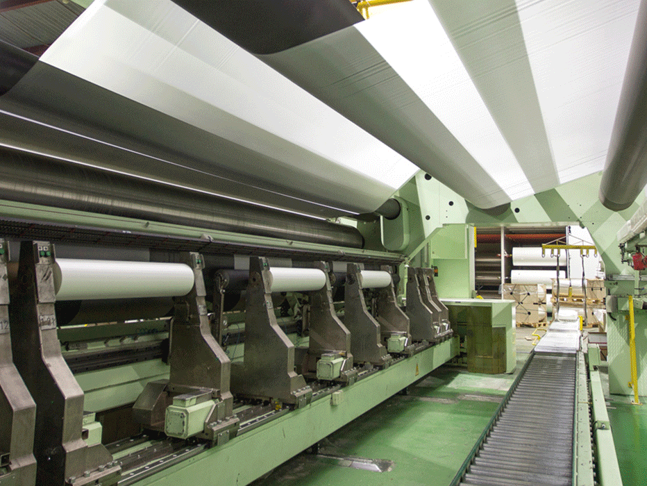
Two years ago the Derprosa™ brand and its renowned factory, which is specially designed for manufacturing laminating films for graphic arts, celebrated its thirtieth birthday. Throughout these past 30 years Derprosa has strived to remain at the forefront of the industry by developing innovative films, always providing something extra for graphic designers, printers/laminators and, above all, the final customers. For it is they who eventually enjoy the experience and properties of Derprosa’s range of films.
During these three decades the commercial printing, secondary packaging and publishing sectors have undergone an immense revolution due to innovation and the development of materials which are much more than just a mere protection for paper and print. Derprosa™ started out by manufacturing one type of gloss film, yet it is now a world market leader when it comes to innovating and commercializing all kinds of different films from gloss, matte, anti-scratch or with different textures (Soft touch, Sandy, Linen…) to antibacterial, digital, metallized and opaque.
Always ensuring that we remain at the forefront we felt the need to upgrade not only our image but also our relationship with society and the way we communicate with it. We entrusted this project to a young graphic design studio (Placida design), which was tasked with helping us to deliver our message in a manner which is more in tune with the world of DESIGN in capital letters. Our films are used by endless brands and designers to cover their best and most carefully designed projects. The aim of this project was to bring conceptual design into the way we communicate what we do.
We have designed a new communication system with the aim of renewing and allowing the brand to evolve. It is visually more modern and therefore adequately captures our innovative essence. We have simplified and unified the images associated with each one of our films adding a better sense of order and cohesion using unique, singular, suitable language. What we want is coherence in our message and something distinguishable from anything else that can be found in the industry. We believe we have achieved this.
And so this ambitious comprehensive project of redesigning the brand and portfolio was born. Its aim was to provide Derprosa™ with greater flexibility and a more effective, functional and coherent means of communication in line with the world of design, art, communication and graphic art. Using multiple geometric and chromatic combinations, a flexible system was designed, which clearly has its roots in the most avant-garde graphic design trends from the middle of the last century.
A graphic brand is not just a mere logo, it’s a formula; a combination of reputation and identity. Not only should an identity be eye-catching, but it should also evoke consistency. It is essential to have a brand with a difference, to know how to use it and make it work.
Given that Derprosa™ operates at a global level, we required a concept for the new identity of the Derprosa™ brand which would be relatable to a worldwide audience. It also had to be recognizable, timeless and long lasting. A grapheme, the letter D, was chosen as the basis for the logo, not only adding an element of verbal expression to the visually communicated concept, but also breaking down the language barrier.
The idea for the graphic design came from two fundamental principles of Bauhaus, which is the academic basis of graphic arts as we know them today. These are use of the basic shapes circle, triangle and rectangle and the motto ‘form follows function’. Our new design is therefore supported at all times by geometric shapes.
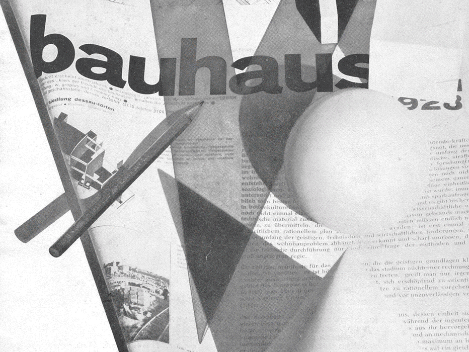
The structure of the brand was based on these principles. It covers the logo, which is the result of a combination of squares, circles and triangles, and the graphic images used for each product.
For these images, a system was used which could be adapted to our two categories of products: one for the main types of finish and another for the different ranges of film available.
With this approach in mind, four different geometric grids were designed for the first category. Three of them were used for the basic optical appearance characteristics common to all products, gloss, matte and silky. The fourth was specifically designated to DL Soft Touch® and all its variations, making this range more noticeable and enabling it to stand out.
For the second category, six color combinations were used. Each combination represents one of the six ranges of film available in the products catalogue.

The result is a fully-programmable visual system, full of shape and color, which provides each product with a unique image and at the same time identifying all of them as part of the same brand, a brand which is innovative, bright and dynamic. What’s more, the system is able to develop new identities systematically, which allows for new additions to any of the ranges using the same graphic code for the image of each type of film.